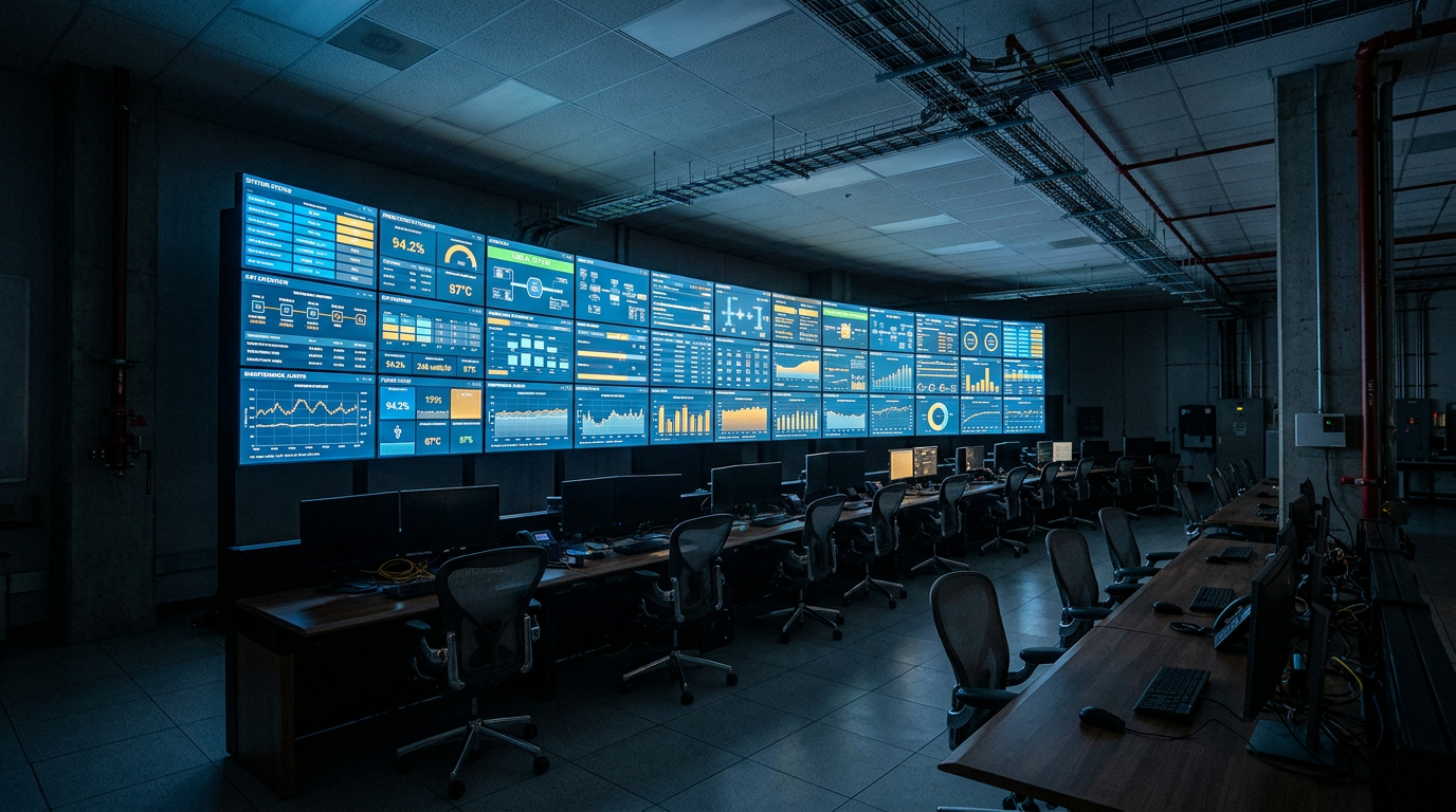
The screens are on the wall. The colors are right. The data refreshes every few minutes. And the morning production meeting runs exactly the way it did a year ago — the same people, the same whiteboard, the same arguments about whose numbers are correct.
If you have invested serious money in a dashboard that changed zero decisions, you are not alone. It is one of the most common and least discussed outcomes in manufacturing digital projects.
The dashboard exists and technically works. Leadership looks at it occasionally. Supervisors glance at it on the way past. But when a real decision needs making — whether to run overtime, stop a line, expedite a part — people still reach for their own spreadsheet, walk the floor, or call someone who knows.
Nobody says the dashboard failed. It just quietly became wallpaper.
It was built around data that was available, not decisions that matter. Many dashboards show whatever the systems could easily export. That is a report, not a decision tool.
Nobody trusts the numbers. If the dashboard disagrees with what a supervisor sees on the floor even once, trust is gone. Without clear definitions and data ownership, one bad number undoes months of work.
No one is expected to act on it. A dashboard without a defined response — who looks, when, and what they do if a number is red — is a display, not a management tool.
It shows lagging results. Yesterday's output is useful for reviewing. It does not help a supervisor save today's shift.
The users were not involved. Dashboards designed in the office for the floor often answer questions the floor does not ask.
The direct cost is the investment that is not returning anything. The indirect cost is larger. Every decision still made on instinct or outdated information carries the losses the dashboard was meant to prevent. And a failed dashboard makes the next data initiative harder to fund and harder to adopt, because everyone remembers the last one.
"More data will make it more useful." Usually the opposite. Fewer, trusted measures tied to specific decisions beat an exhaustive display every time.
"It is a training problem." Sometimes. More often, people understand the dashboard perfectly well and simply do not find it useful for the decisions they actually face.
"We picked the wrong tool." Changing visualization platforms rarely helps if the underlying definitions, data quality and decision ownership stay the same.
Dashboards that drive action tend to be small, specific and owned. Each measure has a clear definition everyone accepts, a named owner, and a known response when it moves. Supervisors see information in time to change the outcome of their shift. And the dashboard replaces the old spreadsheets rather than sitting beside them.
Our data analytics and dashboarding service focuses on decisions first. Lean thinking — visual management tied to daily action — is the discipline behind that, which our sister brand QMSLean specializes in. Related: why OEE can look good while output is missed and measuring digital transformation ROI.
If your dashboard has become wallpaper, read the dashboards situation, then tell us what's going on. We will reply from Info@exceleor.com.
If you have invested serious money in a dashboard that changed zero decisions, you are not alone. It is one of the most common and least discussed outcomes in manufacturing digital projects.
What This Situation Actually Looks Like
The dashboard exists and technically works. Leadership looks at it occasionally. Supervisors glance at it on the way past. But when a real decision needs making — whether to run overtime, stop a line, expedite a part — people still reach for their own spreadsheet, walk the floor, or call someone who knows.
Nobody says the dashboard failed. It just quietly became wallpaper.
Why It Happens
It was built around data that was available, not decisions that matter. Many dashboards show whatever the systems could easily export. That is a report, not a decision tool.
Nobody trusts the numbers. If the dashboard disagrees with what a supervisor sees on the floor even once, trust is gone. Without clear definitions and data ownership, one bad number undoes months of work.
No one is expected to act on it. A dashboard without a defined response — who looks, when, and what they do if a number is red — is a display, not a management tool.
It shows lagging results. Yesterday's output is useful for reviewing. It does not help a supervisor save today's shift.
The users were not involved. Dashboards designed in the office for the floor often answer questions the floor does not ask.
Warning Signs
- People still maintain their own spreadsheets alongside the dashboard.
- Meetings debate whose number is right.
- Nobody can say what action a red indicator should trigger.
- The dashboard has more metrics than anyone can name.
- Usage dropped sharply after the first few weeks.
- Supervisors were not consulted on what it shows.
What It's Costing You
The direct cost is the investment that is not returning anything. The indirect cost is larger. Every decision still made on instinct or outdated information carries the losses the dashboard was meant to prevent. And a failed dashboard makes the next data initiative harder to fund and harder to adopt, because everyone remembers the last one.
Common Misconceptions
"More data will make it more useful." Usually the opposite. Fewer, trusted measures tied to specific decisions beat an exhaustive display every time.
"It is a training problem." Sometimes. More often, people understand the dashboard perfectly well and simply do not find it useful for the decisions they actually face.
"We picked the wrong tool." Changing visualization platforms rarely helps if the underlying definitions, data quality and decision ownership stay the same.
Questions Leaders Should Be Asking
- Which specific decisions was this dashboard supposed to change?
- Do supervisors trust the numbers, and if not, why not?
- Who is expected to act on each measure, and when?
- Are we showing what already happened, or what is about to happen?
- If we removed the dashboard tomorrow, who would notice?
What Good Looks Like
Dashboards that drive action tend to be small, specific and owned. Each measure has a clear definition everyone accepts, a named owner, and a known response when it moves. Supervisors see information in time to change the outcome of their shift. And the dashboard replaces the old spreadsheets rather than sitting beside them.
Our data analytics and dashboarding service focuses on decisions first. Lean thinking — visual management tied to daily action — is the discipline behind that, which our sister brand QMSLean specializes in. Related: why OEE can look good while output is missed and measuring digital transformation ROI.
Frequently Asked Questions
Why don't employees use our manufacturing dashboard?
Usually because it was built around available data rather than the decisions they face, they do not trust the numbers, or nobody defined who should act on it and how.
Should we switch to a different dashboard platform?
Rarely the answer. If definitions, data quality and decision ownership stay the same, a new platform usually produces the same result.
How many metrics should a production dashboard have?
As few as needed to support the specific decisions it serves. Clarity and trust matter far more than coverage.
What is the difference between a report and a decision tool?
A report shows what happened. A decision tool shows the right person, at the right time, what needs action — with an agreed response.
Tell Us What's Going On
If your dashboard has become wallpaper, read the dashboards situation, then tell us what's going on. We will reply from Info@exceleor.com.